6.06.2012

DaapWorks!


My final thesis work is on display right now in the Reed Gallery!
Here's what I chose to show:
The piece to the left is the large (29" x 29") center panel of the triptych.
Check out the installation view below it to see how it looks on the gallery wall!
It's called Impetus Indefinitely Renewed (check out this previous post to see the story behind the title).
The small (9"x9") paintings are called Palimpsests, and they are sort of the offspring of the central piece, which is in the process of spawning more palimpsests.
It's about the endless cycle of renewal in art, and the inevitable course or growth and evolution. Fun, huh?
Check out this post if you want to see the six palimpsests in utero.

If you're wondering why the images of the smaller pieces look so much better, it's because they're from the digital scanners at school, while the photos of the larger piece are from my very vintage camera. If anyone has access to a giant digital scanner and they want to let me use it, let me know!

This work is on display 'til Saturday, along with some absolutely amazing thesis work from all my fellow Daapers. Go check it out!

5.28.2012

Henrique Oliveira, and other artists I want to share a bottle of wine with

The more I learn about art, the more that I realize I don’t know much. It’s an utterly obvious result: when horizons expand, the world gets larger. Amazing art is being made every day in every corner of the world; sometimes I feel a bit overwhelmed with anxiety because I will never see one tenth of it. Still, there is a special kind of satisfaction that comes from “discovering” artists on my own,especially ones that make the kind of art that I feel in my gut.
        Recently,while searching for contemporary artists who work with wood, I found Brazilian artist Henrique Oliveira. I was immediately attracted to his work; it is undeniably beautiful. He has amassed a large body of work, especially considering his young age and the large size and complexity of his installations. He began as a painter, but as he earned his Masters Degree in Visual Poetics (I love that this degree exists) he began working with the scrap wood he found in the slums of Sao Paolo. It is cheap, thin wood used as a sort of fencing around construction sites. It is painted, used for a few months, and then discarded. Oliveira noticed that when the thin wood was broken, the shards of wooden splinters were visually similar to his expressive brush strokes. He began assembling the scraps of wood he collected into what he called tri-dimensionals. Beyond the beauty of his work, I am inspired by his creative use of material and how he has merged painting, sculpture and installation. I only included a few images of his work, but they show the progression he made from his roots in painting to fully embracing installation and sculpture.Seeing his organic progression and growth is also inspiring to me, because I am currently concerned with merging my own 2-d and 3-d work.
Whirlwind for Turner, 2007, by Henrique Oliveira
Tapumes, 2009, by Henrique Oliveira
Bololo, 2011, by Henrique Oliveira

      Last fall I made an installation out of string and light (click here to see my blog post about it). Before I began, I wanted to research installation artists who work with string. (I like to be prepared during critique to acknowledge specific inspirations; if my teacher points out that my work is similar to an established artist, I want to be aware of those similarities.) I stumbled upon Japanese artist Chiharu Shiota. She uses string to fill spaces, often obscuring or revealing other objects in the process. These installations have a spooky, dream-like quality. There is a respect for the simplicity of the medium which gives the work a sort of innocence and purity.In my installation, I tried to achieve a similar respect for material, by using nothing but white cotton string and no other visible materials or hard ware. I was thrilled to see one of her small vitrine-like installations at the Armory Show in New York.
In Silence, 2009, by Chiharu Shiota
TobiasTovera is a San Fransisco-based artist. Visually, his paintings are similar to my ink paintings; they might be the closest thing I have seen to how some of my own art looks. His use of color is a bit more clear and prismatic, and his images have fewer figurative connotations than mine, but I admire his use of scale and space.
Deepening Undercurrent, Pigment on panel, 5' x 5', 2008, by Tobias Tovera

AdamFrelin was a visiting lecturer this year. He was by far my favorite out of all the artists who have visited DAAP. He is open to all types of media, and his work is infused with intelligence and humor. There is something poetic about it, in the way that his work offers satisfying connections and also raises questions,to keep the viewer engaged and inspired. It’s like the perfect appetizer, which tastes really good but keeps you hungry for more. Go to his website; a lot of his work is performance or process-based, so it needs to be explored to be appreciated.
Mirror Ball Roll (One), 2009, by Adam Frelin

There are countless other artists that I have “discovered” who have inspired me in less direct ways. Some of my recent favorites include Leandro Erlich, TroyAbbott, Slinkachu, Isaac Cordal, and Gregory Scott. I discovered these and others from magazines, the internet, and from my classmates and teachers. A few of them I saw for the first time in New York, either at the Armory or one of the satellite shows. (All of these, plus a lot more, are featured on my Pinterest "Favorite Artists" board. Yes, I know, Pinterest is a time-suck, but it's also a handy way of keeping track of things I might otherwise forget.)

It is hard to describe the type of inspiration that can be had just from looking at interesting art. Often it is like reading a menu when you are really hungry. Occasionally it feels more like jumping jacks; it gets the blood flowing and the heart pounding. Sometimes it feels like a jolt of caffeine which wakes me from a stupor, and which makes me want to stop writing this blog post and go make some art.

5.25.2012

New Art! (It's taking over my entire house)

I just thought I would share the reasons why I haven't made a lot of posts lately; this is about one third of what I've churned out over the last three weeks. The "Palimpsests" for my thesis show will likely be chosen from among these:

I started this one months ago; it's been languishing in a pile of rejects until last week. I love when a reject becomes a success!

This was another reject; it is the sibling of the one above.

 I don't know it I've mentioned that I do these in sets of 2, 3, or 4; I consider the sets "siblings" or "cousins." They share the same genetic background, artistically speaking. They often begin as prints of one another, made through a self-devised monoprinting process. Fun!
My first experiment with adding silver pigment to the ink. I was hesitant to try it, afraid that it would look like a gimmick, But I like it!

I don't think this one is done yet, but I'm not sure what the next mutation will be. I think it will need to languish in a pile of rejects for a while.

This one is the sibling of the one above it. Also not quite ready... I need to neglect it for a while.

More silver pigment; also, my first on a square instead of a rectangle.

Sibling of the one above it. I have since switched to square for my preferred format. Compositionally, it's a lot more challenging, but I like it anyway.

The zygote of this one is from last December. I love it's evolution.

This is the cousin of the one above it. They began together, but diverged too far apart to remain siblings.

Part coral reef, part diseased internal organ, part Hubble telescope image.

This is the sibling of the one above it. Diseased liver, anyone? Mmmm.

Jellyfish-skull-eruption thingy; I love the colors.

The unfinished cousin of the one above it.

This is the first of three juicy little paintings. I might cut them down into squares (from 9x12 to 9x9) and include them in my thesis show.

The one unfinished sibling of the three. I'm afraid to touch it right now.

My favorite of the three. The ink is so rich and glossy on the vellum, which the scanned images don't really convey.
 Below, I have a bit of an octo-mom situation. All 8 of these are siblings, begun and evolving concurrently. They are all 9x9, already perfect for my ideal layout for the thesis show.


Might be my least favorite of the family. Red-headed step-child?

Maybe my favorite of this family? Not sure yet

This one looks like an alien embryo grasping its over-sized skull.
So, here's a little verse I wrote for my thesis paper. I wrote it in the midst of complete exhaustion and frustration, at 2 in the morning, so forgive me if it seems a bit maudlin. I based part of my artist statement on it (see my last post), so hopefully it's not completely awful:


if my art is an expression of my inner somethings
if it is a reflection of my joys and pains
my anxieties and satisfactions
my angers and my wisdoms
my foolishness and my triumphs
if my art is to be all of this
then it will be unrecognizable
it will appear alien
it will be everything to me and nothing to everyone else
it will be empty and full
it will be tiny and vast
it will be thorns, it will be petals
it will be blood and bone:
parasitic little tumors
cancerous little beasts
anomalies, events, curiosities
malevolent and beautiful
resplendent and repulsive
both the crime and the witness
blossoming then blooming
melting but frozen
liquefying, solidifying
in flux
but petrified, suspended
a supernova in its own tiny universe
a cyst, a growth
neither plant, nor animal, nor mineral
but an amalgamation of the three

I used to write poetry a lot when I was a kid. It's hard to write a good poem; I think I stopped writing them because I was afraid of failure. For me, good wasn't enough- unless I felt I could achieve perfection, I didn't bother. I mean, my poems were good for an eighth grader, but not compared to what I was studying in school at the time. It's a strange combination of cowardice and vanity that stops us from trying something which will likely result in failure.
So, for me, the thesis verse represents re-gaining my courage, hopefully with the humility to recognize that I will most likely fail, most of the time. Speaking of which...
 I need to get back to work!


5.24.2012

Word Nerd, Revisited: the dreaded artist statement

This year, DAAPworks is doing something new. Beyond just the ordinary labels with the name and title of each work, every student is also required to write a short statement, which will be hung near the work. This allows visitors who are unfamiliar with a student's oeuvre (oeuvre: the works of a writer, painter, or the like, taken as a whole) a chance to understand a bit of background or intent. 
This is what I wrote:
"parasitic little tumors, cancerous little beasts
both the crime and the witness
blossoming then blooming
melting but frozen
liquefying, solidifying
preserved and suspended
like a supernova in its own tiny universe
in flux
neither plant, nor animal, nor mineral
but an amalgamation of the three
 
These paintings were conceived from loss, but they are about growth. No amount of memory loss will result in losing my self, as long as I keep building and making and replacing the voids with new creations. The themes of loss and despair, juxtaposed with the satisfaction and hope caused by the act of creation, have provided an amazing depth of challenges and inspiration for my work."

 I thought maybe the first half was a bit too esoteric (esoteric: restricted to or intended for an enlightened minority, esp because of abstruseness or obscurity; difficult to understand, abstruse) so I gave Aaron, the gallery director, the option of including only the second half. 

 Hopefully, the artist statement will add some weight to the work, instead of just being another random distraction on the wall. I'm also hoping that the statement will help clarify my titles, which are definitely in danger of being esoteric (for more on this, read my last post).

I am definitely looking forward to reading the statements of other students, especially those of other majors (fashion, architecture, etc). 


Palimpsestic Impetus: A word-nerd chooses her titles

This week I had to hand in titles for my BFA thesis show; the gallery director needed them to make labels to stick on the wall next to our work.
Titling non-existent art is a tricky, tricky business!

First, I decided on a layout for the work. I will be hanging 7 pieces; one large one (probably 36" x 36") will be in the middle, with three more small ones on each side. The three small ones (probably 9" x 9") will share a large set of glass panels, and will be spaced vertically under the glass. The final arrangement ought to look like a triptych.

Triptych is a term generally applied to sets of three 2-d works which are meant to be displayed side-by-side, with the center panel being the main element.

I'm hoping to evoke the original, more specific intent of the word:
triptych "hinged, three-leaved writing tablet used in ancient Greece and Rome," from Gk. triptykhos "three-layered," from tri- "three" + ptykhos, gen. of ptyx "fold, layer."

I'm reinforcing this allusion by titling the six small pieces "Palimpsests, No. 1-6."

palimpsest "a parchment or the like from which writing has been partially or completely erased to make room for another text," from Latin palimpsestus  parchment cleaned for reuse, from Greek palimpsÄ“stos,  from palin  again + psÄ“stos  rubbed smooth, from psÄ“n  to scrape

It's a bit of an awkward word, palimpsest; it doesn't exactly roll off the tongue. But it satisfies several needs:
1. I've been wanting to use it as a title for a really long time.
2. It sounds smart. Yeah, that's right, I'm smart.
3. It's actually perfect, thematically speaking. My little ink paintings are about growth in a reclaimed space that only exists in the wake of erasure and loss. They all begin as pristine little paintings which are corrupted and partially erased; a new painting grows out of the remnants left behind. 


Henri Michaux, Belgian/French writer and artist, ca. 1936. Photo by Gisèle Freund


While I was writing my thesis paper a few weeks ago, I was reading Miserable Miracle by Henri Michaux. The book is based on a journal he wrote while heavily experimenting with drugs. It would be unreadable if any normal fool had written it, but Michaux was an incredibly talented and unusual man. The edition which I was reading was awesome; the editors had thoughtfully included text which Michaux had scribbled in the margins of his journal. There, I found the phrases "Impetus in jerks," and "Impetus indefinitely renewed." The phrases stuck with me, and I scribbled them in my own little journal.
At that point, I was still developing my final thesis statement. Until then, I had focused on the erasure and the corruption, and I hadn't yet consciously realized that my thesis was more about rebirth and growth.
I couldn't stop repeating Michaux's peculiar phrasing in my mind.

(Let me pause for a moment, to define impetus for anyone who isn't quite sure what it means.
impetus: an impelling movement or force; incentive or impulse; stimulus; the force that sets a body in motion.)

Impetus seems to aptly describe my motivation to make art, and more specifically, to make art about memory and loss. The "indefinitely renewed" part is even better: it describes the realization at which I was concurrently arriving. My memory loss had caused anxiety that I would lose myself, but I realized that was impossible as long as I keep making art. It heals my brain, keeps it full, and fills in the voids lefts behind when something is forgotten. Thus, my impetus to make art will be indefinitely renewed.
Sorry for the blah-blah-blah, but it was necessary to explain why the central panel of the triptych will be called "Impetus, Indefinitely Renewed."
http://i.biblio.com/o/014/170/9781590170014.RH.jpg
I recommend it highly; be prepared for some meandering, it's to be expected.


So far, I think I have the little palimpsests done, although I know I will make a million more, and choose my six favorites. All of my attempts at the large central piece have been investigational (read: failures). Just in case it doesn't happen, I requested titles for 3 more palimpsests, which will be shown with the others in a square layout of 9. This is a last resort, but hey, a girl's gotta have a backup plan.

So, I have SIX AND A HALF DAYS until my completed work has to be dropped off at the gallery. In ten days, I will be installing the work. In twelve days, I will be handing in the final dvd disc with all my work on it. In THIRTEEN DAYS, our thesis show opens (see my last post.)
In SEVENTEEN DAYS, I WILL BE GRADUATING!  (gasp!)


5.16.2012

I Know, It's Hard to Believe...


Come See
The Long-Awaited 
(you know what I mean, people)
Senior Thesis Show
of 
Jackie Hopkins Bond

it's only a few weeks away!

Opening: June 5, 5pm to 9pm
June 6-8, 9am to 9pm
June 9, 10am to noon

for more info click here


I would love to include more details, but I don't want to ruin the suspense...

4.05.2012

This is the Art of a Crazy Person

This quarter I am in the ridiculous situation of being an about-to-graduate senior taking not one, but two freshman-level classes. These are required for me to graduate; as a transfer student, I didn't realize I had to take them until last spring.
I don't hate these classes. I have been taking the lecture seminars all year and they have been relatively easy, fun, and even sometimes enlightening.
This quarter, I am also taking a foundations studio class, called Time Studio. (It's the final in the series, after Surface and Space Studios; I didn't have to take those.)

Our first assignment involved finding an iconic historical image (album cover, photograph, news image, painting, etc.) and recreate it by photographing ourselves in place of the original figures. We had to build any necessary costumes, props, and stage sets, and then combine our images within Photoshop to recreate the original image as closely as possible. The catch is that we have to be every character in the image, and we have to appear more than once.
We had about a week to do this. (Yikes. I am severely lacking in Photoshop skills.)

I chose, after much deliberation, Manet's A Bar at the Folies-Bergere, originally painted in 1882.
(If you want to listen to a fascinating theoretical analysis about this painting, check out this video from ArtRev.com.)
Manet's Bar at the Folies-Bergere, 1882. I've never seen it in person; it's permanent home is in London. But I recently saw some lovely Manets in New York, at the Metropolitan Museum of Art.  Awesome.
 I was torn for a while between doing a faithful, accurate recreation OR doing a personal/autobiographical modern interpretation. I ended up with a hybrid.

I painted this background with ink on vellum. I am determined to relate this foundational work to my thesis work, no matter how tenuous the connection. In this case, I decided to use the techniques I have been developing in my advanced studios to create this background. It is by far the largest painting I have made with ink on vellum; it is about eight feet long and three feet high.
Here it is. What should I call it? It may be too ridiculous to title. I do kind of love it- it's hanging on my fridge.
The only part that I stole from the original is the top hat on the anonymous "gentleman."
The only thing I stole from Google Images was Burt Reynold's mustache. Everything else was something I found around the house or created myself. I created the marble finish of the bar by smearing graphite powder onto a large sheet of vellum- it looked pretty dumb in person, but it looks good in the final image.
I had to use Twinkies in place of the Mandarin oranges (lovelovelove) and I used beer instead of champagne. The whiskey bottle has iced tea in it- whiskey doesn't usually last long in my house. Crown Royal is a sentimental favorite; there was another bottle, but it was cropped out.

Stuff that I learned from this project:
I am not used to these short term projects with specific parameters. I was sort of dreading it, but now I realize how much I've been missing these types of assignments; I forgot that they could be fun.
If I had more time, I would have found a way to use a picture of my great-grandmother's locket in place of the barmaid's cameo. I also would have liked to use fresh flowers from my own yard, instead of the fake ones I used; unfortunately, everything in my yard is about to bloom or did weeks ago. Lastly, I never addressed the feet of the trapeze artist, which are visible in the upper left hand corner of Manet's painting. I could have photographed my own feet in green socks. I also considered replacing the feet with an image of a tiny bird on a perch which I sculpted a couple of years ago. I liked the idea of comparing Manet's barmaid to a bird in a cage. Sigh- if my Photoshop skills were better, I would have had time to fix these little details.

Next we have to re-interpret a piece of found trash into a mixed-media sculpture, using digital media. I think it's supposed to be about absurdity. FUN!


4.01.2012

my art in The Real World

SPRING BREAK:
I spent my lovely, fleeting, precious spring break cooped up indoors like a madwoman, taping up new work all over the house and spreading art supplies all over the dining room. Why? Because my friend Cole is opening a new restaurant in Lexington, and he asked me to provide some art for the walls in time for the opening (which is officially THIS MONDAY!) I visited the restaurant first, to show some of my old work to Cole and his mom (the decorator) and to see what kind of space I had to fill. I decided that I needed to do all new work (of course.)
I made new work in the same style, with the same techniques and materials as my recent work,  but I let myself just follow my instincts and make pretty pictures, instead of obsessing about my thesis.
PLANNING TO INSTALL:
I decided that plexiglass wasn't working for me, mostly because it is nearly as expensive as real glass. I called around and found a place that would cut glass to custom sizes, have my order ready in less than 24 hours, and not charge me an arm and a leg. I also made my own labels for the first time, with the titles (which I have lots of doubts about) and the prices (more on that later.) I bought hardware for hanging, which mostly involved mirror clips, and packed up my toolbox with everything I thought I might need: power tools, measuring tools, tape, all that fun stuff.
THE INSTALLATION:
Ugh- took twice as many trips to Lexington as I planned, and about three times as many hours as I thought it would. The lighting was good already, so I didn't have to worry about that, but there were permanent frames already attached to the walls, which made measuring kind of a challenge. I put my laser level to work a lot.
The walls were old, with plaster over brick, so they were hard to drill into and were not exactly flat. The dining room was already decorated with lovely pillows and cushions, so I had to be really careful about making a mess with all my dust. Once I had the measurements done, and the holes drilled, I definitely needed help actually hanging the pieces. The glass is way heavier than plexiglass, and without help I probably would have broken half the work (thankyouthankyouthankyou Mr.Turnbull.)
WHAT I LEARNED:
Installation takes way longer than you think it will. There will be problems. It is work.
When pricing your work, DO NOT forget cost of shipping (or in this case, gas money) or the hours spent installing, deinstalling, and all that stuff. I did not remember these factors; I wanted to put low prices on everything, (they ranged from $40 to $150), but by the time I added up all costs involved, I'll make about fourteen cents an hour if everything sells (which is about fourteen cents more per hour than I've ever made before from art, so I should stop complaining, right?)
THE BEST PART:
By far, the best part was cleaning up after I was done, looking up, and realizing that it looked good. I would have chalked up this reaction to exhaustion and relief, but everyone else seemed to like it too (they were all pretty exhausted too... so who knows, really.)
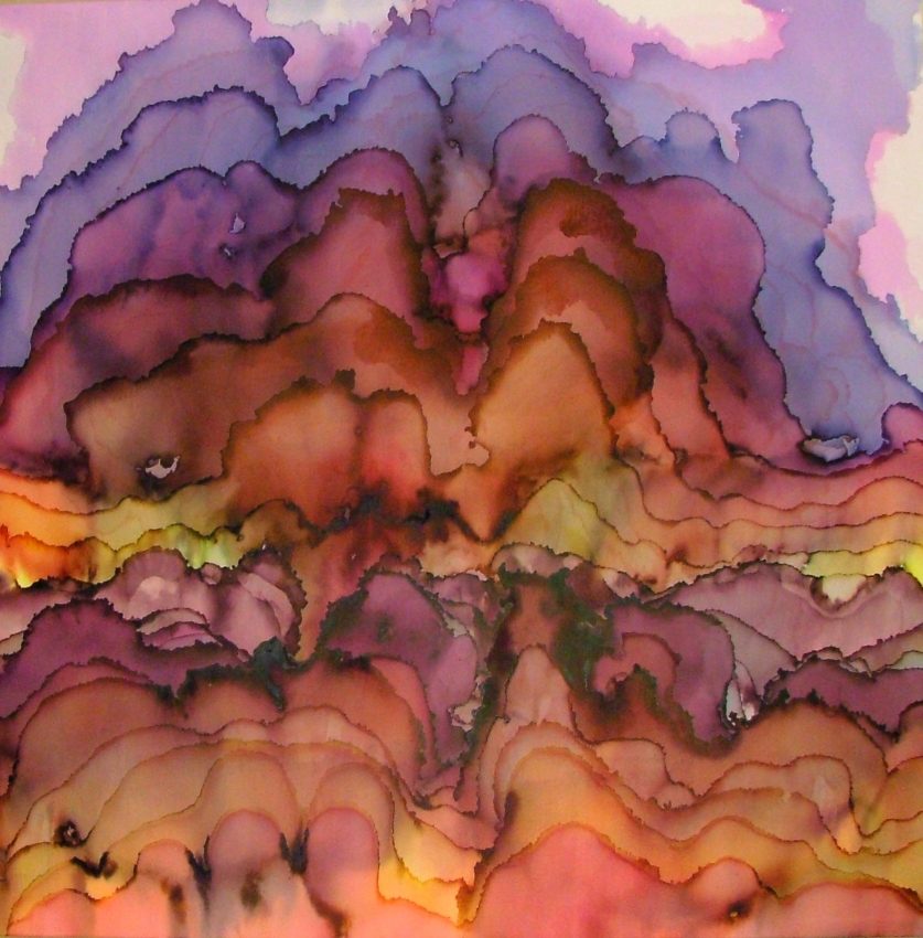
OKAY, OKAY, HERE'S SOME PICS:
Asteroid #1, 9x12

Asteroid #2, 9x12

Primordial Asteroid, 9x12
The three above are the smallest, each priced at forty bucks. A bargain!


The three above are all 9x12, but they are framed together behind the same piece of glass, as a set titled Amalgamations X, Y, and Z. Another bargain at $105 for the set.


The two above are titled Early Spring, # 1 and #2. It sounds corny, I know, but I was inspired by the early spring here in Cincinnati; it's my very favorite time of the year. They are each $85 (and they are both 14x17).


These two are titled Dawn #1 and Dawn #2, each are 14x17, and $85. These might be my favorites.

There are more, but I don't have good images of them because they are too big for the scanners. They are each 9x36. If I get a good photo of them, I'll post them.


Here's some pictures of the restaurant after the installation. Sorry about the terrible quality of my photos- the sun was starting to go down, and I couldn't use the flash without really weird reflections off the glass.

So... if you find yourself in Lexington, and you need a delicious dinner and you want to see some art, visit Coles 735 Main.