Okay, so I'm in the early stages of love with my new favorite inspiration: cartography.
It's become more than a casual fling: now I am buying books on the subject.
It started to get deep a few weeks ago when I was listening to This American Life on NPR. Author Denis Wood was discussing his new book (not yet released but I already pre-ordered it on Amazon) Denis Wood: Everything Sings, 2nd Revised Edition: Maps for a Narrative Atlas, in which he diagrams seemingly mundane details in his own neighborhood. The result is a fascinating, revealing, and often poetic look into demographics and geography... I was salivating by the end of the interview, and even went into work a couple of minutes late so I could hear all of it. I can't do this interview justice, so you can stream the entire episode from here.
I've always been attracted to art with obsessive tendencies. Ritual, repetition, and collection seem to combine acts both hyper-cerebral and empty/meditative. It's a good place to be if you want to tap into deeper creativity (as an artist) or deeper connection (as a witness).
This is not all-new territory for me; obsessive repetition was a common feature in my work over the last few years as I explored the phenomenon of deja vu, and its (personally) sinister role as a harbinger of a seizure.
But the new appeal is in adding the dimensions of space and time to create a diagram of some otherwise invisible truth. Denis Wood reminded me that anything can be mapped. The cover of his book features a geographic layout of carved pumpkin faces in his town. The areas of highly concentrated pumpkins correlated to wealthy areas, while the pumpkin-less deserts were confined to poorer areas. This raises questions. Is it merely a matter of the cost of the pumpkins being prohibitive? Or is there an element of neighborly expectations at work in the wealthier neighborhoods? One map of pumpkin placement is just one piece of a puzzle with infinite pieces; as more are collected and compared, more questions can be raised, and more truths can be revealed.
While I certainly wouldn't mind copying Denis Wood's ideas as an exercise, I want to find my own systems for mapping. In my quest to develop my own cartography, I ordered some intriguing books which just arrived (Amazon delivery is the new Santa Claus, and today was Christmas).
First:
Visual Complexity: Mapping Patterns of Information by Manuel Lima
It's a visually stunning collection of maps which go way beyond the traditional two-dimensional geographical versions we keep stuffed in our glove boxes (or used to, before GPS).
Some of the most compelling images are maps of information systems, internet connections, blogospheres, etc, which track the exchange of data between hosts. I just started delving into this hefty book, but I'm already struck by how the formerly mentioned maps resemble those of neural bonds, genetic connectors, weather patterns, and other "natural" phenomena.
Second:
Cartographies of Time: A History of the Timeline by Daniel Rosenberg and Anthony Grafton
Why? I love a good history book, especially one like this which describe methodologies as a window into interpreting other known histories. Also, I like the idea of working the dimension of time into a map.
While Manuel Lima's book is heavily focused on computer-rendered imagery, this one is full of hand-drawn timelines. Think family trees, geneologies, mythologies, prophetic predictions, and astronomical diagrams. Even tree rings of an ancient sequoia are included, with pinned markers to indicate major historical events. Lovely.
So, this was a long-ish post with no pictures. By my next post, hopefully I will have some images of preliminary experiments or at least images "borrowed" from my continued research.
In the meantime, I have been painting new ink-on-vellum pieces to hang in Cole's 735 Main in Lexington. People are actually buying them!
Showing posts with label Inspiration. Show all posts
Showing posts with label Inspiration. Show all posts
1.29.2013
5.28.2012
Henrique Oliveira, and other artists I want to share a bottle of wine with
The more I learn about art, the more that I realize I don’t know much. It’s an utterly obvious result: when horizons expand, the world gets larger. Amazing art is being made every day in every corner of the world; sometimes I feel a bit overwhelmed with anxiety because I will never see one tenth of it. Still, there is a special kind of satisfaction that comes from “discovering” artists on my own,especially ones that make the kind of art that I feel in my gut.
Recently,while searching for contemporary artists who work with wood, I found Brazilian artist Henrique Oliveira. I was immediately attracted to his work; it is undeniably beautiful. He has amassed a large body of work, especially considering his young age and the large size and complexity of his installations. He began as a painter, but as he earned his Masters Degree in Visual Poetics (I love that this degree exists) he began working with the scrap wood he found in the slums of Sao Paolo. It is cheap, thin wood used as a sort of fencing around construction sites. It is painted, used for a few months, and then discarded. Oliveira noticed that when the thin wood was broken, the shards of wooden splinters were visually similar to his expressive brush strokes. He began assembling the scraps of wood he collected into what he called tri-dimensionals. Beyond the beauty of his work, I am inspired by his creative use of material and how he has merged painting, sculpture and installation. I only included a few images of his work, but they show the progression he made from his roots in painting to fully embracing installation and sculpture.Seeing his organic progression and growth is also inspiring to me, because I am currently concerned with merging my own 2-d and 3-d work.
 |
| Whirlwind for Turner, 2007, by Henrique Oliveira |
 |
| Tapumes, 2009, by Henrique Oliveira |
 |
| Bololo, 2011, by Henrique Oliveira |
Last fall I made an installation out of string and light (click here to see my blog post about it). Before I began, I wanted to research installation artists who work with string. (I like to be prepared during critique to acknowledge specific inspirations; if my teacher points out that my work is similar to an established artist, I want to be aware of those similarities.) I stumbled upon Japanese artist Chiharu Shiota. She uses string to fill spaces, often obscuring or revealing other objects in the process. These installations have a spooky, dream-like quality. There is a respect for the simplicity of the medium which gives the work a sort of innocence and purity.In my installation, I tried to achieve a similar respect for material, by using nothing but white cotton string and no other visible materials or hard ware. I was thrilled to see one of her small vitrine-like installations at the Armory Show in New York.
 |
| In Silence, 2009, by Chiharu Shiota |
TobiasTovera is a San Fransisco-based artist. Visually, his paintings are similar to my ink paintings; they might be the closest thing I have seen to how some of my own art looks. His use of color is a bit more clear and prismatic, and his images have fewer figurative connotations than mine, but I admire his use of scale and space.
 |
| Deepening Undercurrent, Pigment on panel, 5' x 5', 2008, by Tobias Tovera |
AdamFrelin was a visiting lecturer this year. He was by far my favorite out of all the artists who have visited DAAP. He is open to all types of media, and his work is infused with intelligence and humor. There is something poetic about it, in the way that his work offers satisfying connections and also raises questions,to keep the viewer engaged and inspired. It’s like the perfect appetizer, which tastes really good but keeps you hungry for more. Go to his website; a lot of his work is performance or process-based, so it needs to be explored to be appreciated.
 |
| Mirror Ball Roll (One), 2009, by Adam Frelin |
There are countless other artists that I have “discovered” who have inspired me in less direct ways. Some of my recent favorites include Leandro Erlich, TroyAbbott, Slinkachu, Isaac Cordal, and Gregory Scott. I discovered these and others from magazines, the internet, and from my classmates and teachers. A few of them I saw for the first time in New York, either at the Armory or one of the satellite shows. (All of these, plus a lot more, are featured on my Pinterest "Favorite Artists" board. Yes, I know, Pinterest is a time-suck, but it's also a handy way of keeping track of things I might otherwise forget.)
It is hard to describe the type of inspiration that can be had just from looking at interesting art. Often it is like reading a menu when you are really hungry. Occasionally it feels more like jumping jacks; it gets the blood flowing and the heart pounding. Sometimes it feels like a jolt of caffeine which wakes me from a stupor, and which makes me want to stop writing this blog post and go make some art.
It is hard to describe the type of inspiration that can be had just from looking at interesting art. Often it is like reading a menu when you are really hungry. Occasionally it feels more like jumping jacks; it gets the blood flowing and the heart pounding. Sometimes it feels like a jolt of caffeine which wakes me from a stupor, and which makes me want to stop writing this blog post and go make some art.
5.24.2012
Palimpsestic Impetus: A word-nerd chooses her titles
This week I had to hand in titles for my BFA thesis show; the gallery director needed them to make labels to stick on the wall next to our work.
First, I decided on a layout for the work. I will be hanging 7 pieces; one large one (probably 36" x 36") will be in the middle, with three more small ones on each side. The three small ones (probably 9" x 9") will share a large set of glass panels, and will be spaced vertically under the glass. The final arrangement ought to look like a triptych.
Triptych is a term generally applied to sets of three 2-d works which are meant to be displayed side-by-side, with the center panel being the main element.
I'm hoping to evoke the original, more specific intent of the word:
triptych : "hinged, three-leaved writing tablet used in ancient Greece and Rome," from Gk. triptykhos "three-layered," from tri- "three" + ptykhos, gen. of ptyx "fold, layer."
I'm reinforcing this allusion by titling the six small pieces "Palimpsests, No. 1-6."
palimpsest : "a parchment or the like from which writing has been partially or completely erased to make room for another text," from Latin palimpsestus parchment cleaned for reuse, from Greek palimpsēstos, from palin again + psēstos rubbed smooth, from psēn to scrape
It's a bit of an awkward word, palimpsest; it doesn't exactly roll off the tongue. But it satisfies several needs:
1. I've been wanting to use it as a title for a really long time.
2. It sounds smart. Yeah, that's right, I'm smart.
3. It's actually perfect, thematically speaking. My little ink paintings are about growth in a reclaimed space that only exists in the wake of erasure and loss. They all begin as pristine little paintings which are corrupted and partially erased; a new painting grows out of the remnants left behind.
While I was writing my thesis paper a few weeks ago, I was reading Miserable Miracle by Henri Michaux. The book is based on a journal he wrote while heavily experimenting with drugs. It would be unreadable if any normal fool had written it, but Michaux was an incredibly talented and unusual man. The edition which I was reading was awesome; the editors had thoughtfully included text which Michaux had scribbled in the margins of his journal. There, I found the phrases "Impetus in jerks," and "Impetus indefinitely renewed." The phrases stuck with me, and I scribbled them in my own little journal.
At that point, I was still developing my final thesis statement. Until then, I had focused on the erasure and the corruption, and I hadn't yet consciously realized that my thesis was more about rebirth and growth.
I couldn't stop repeating Michaux's peculiar phrasing in my mind.
(Let me pause for a moment, to define impetus for anyone who isn't quite sure what it means.
impetus: an impelling movement or force; incentive or impulse; stimulus; the force that sets a body in motion.)
Impetus seems to aptly describe my motivation to make art, and more specifically, to make art about memory and loss. The "indefinitely renewed" part is even better: it describes the realization at which I was concurrently arriving. My memory loss had caused anxiety that I would lose myself, but I realized that was impossible as long as I keep making art. It heals my brain, keeps it full, and fills in the voids lefts behind when something is forgotten. Thus, my impetus to make art will be indefinitely renewed.
Sorry for the blah-blah-blah, but it was necessary to explain why the central panel of the triptych will be called "Impetus, Indefinitely Renewed."
So far, I think I have the little palimpsests done, although I know I will make a million more, and choose my six favorites. All of my attempts at the large central piece have been investigational (read: failures). Just in case it doesn't happen, I requested titles for 3 more palimpsests, which will be shown with the others in a square layout of 9. This is a last resort, but hey, a girl's gotta have a backup plan.
So, I have SIX AND A HALF DAYS until my completed work has to be dropped off at the gallery. In ten days, I will be installing the work. In twelve days, I will be handing in the final dvd disc with all my work on it. In THIRTEEN DAYS, our thesis show opens (see my last post.)
In SEVENTEEN DAYS, I WILL BE GRADUATING! (gasp!)
Titling non-existent art is a tricky, tricky business!
First, I decided on a layout for the work. I will be hanging 7 pieces; one large one (probably 36" x 36") will be in the middle, with three more small ones on each side. The three small ones (probably 9" x 9") will share a large set of glass panels, and will be spaced vertically under the glass. The final arrangement ought to look like a triptych.
Triptych is a term generally applied to sets of three 2-d works which are meant to be displayed side-by-side, with the center panel being the main element.
I'm hoping to evoke the original, more specific intent of the word:
triptych : "hinged, three-leaved writing tablet used in ancient Greece and Rome," from Gk. triptykhos "three-layered," from tri- "three" + ptykhos, gen. of ptyx "fold, layer."
I'm reinforcing this allusion by titling the six small pieces "Palimpsests, No. 1-6."
palimpsest : "a parchment or the like from which writing has been partially or completely erased to make room for another text," from Latin palimpsestus parchment cleaned for reuse, from Greek palimpsēstos, from palin again + psēstos rubbed smooth, from psēn to scrape
It's a bit of an awkward word, palimpsest; it doesn't exactly roll off the tongue. But it satisfies several needs:
1. I've been wanting to use it as a title for a really long time.
2. It sounds smart. Yeah, that's right, I'm smart.
3. It's actually perfect, thematically speaking. My little ink paintings are about growth in a reclaimed space that only exists in the wake of erasure and loss. They all begin as pristine little paintings which are corrupted and partially erased; a new painting grows out of the remnants left behind.
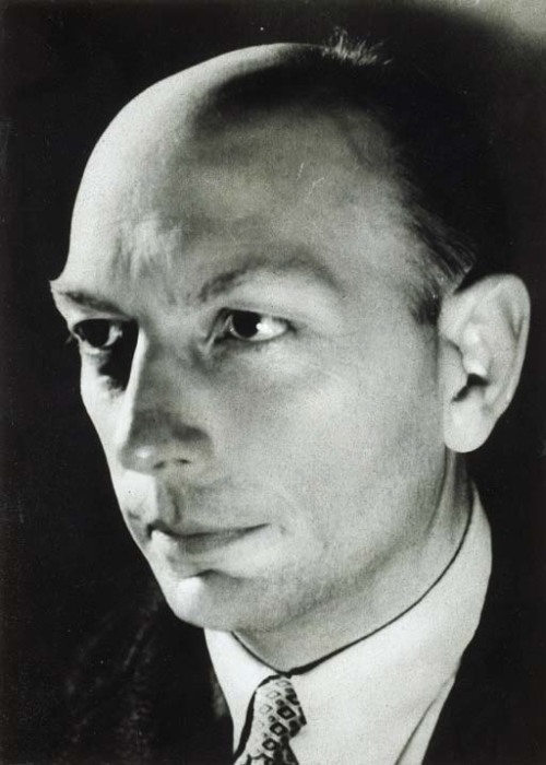 | |
| Henri Michaux, Belgian/French writer and artist, ca. 1936 | . Photo by Gisèle Freund |
While I was writing my thesis paper a few weeks ago, I was reading Miserable Miracle by Henri Michaux. The book is based on a journal he wrote while heavily experimenting with drugs. It would be unreadable if any normal fool had written it, but Michaux was an incredibly talented and unusual man. The edition which I was reading was awesome; the editors had thoughtfully included text which Michaux had scribbled in the margins of his journal. There, I found the phrases "Impetus in jerks," and "Impetus indefinitely renewed." The phrases stuck with me, and I scribbled them in my own little journal.
At that point, I was still developing my final thesis statement. Until then, I had focused on the erasure and the corruption, and I hadn't yet consciously realized that my thesis was more about rebirth and growth.
I couldn't stop repeating Michaux's peculiar phrasing in my mind.
(Let me pause for a moment, to define impetus for anyone who isn't quite sure what it means.
impetus: an impelling movement or force; incentive or impulse; stimulus; the force that sets a body in motion.)
Impetus seems to aptly describe my motivation to make art, and more specifically, to make art about memory and loss. The "indefinitely renewed" part is even better: it describes the realization at which I was concurrently arriving. My memory loss had caused anxiety that I would lose myself, but I realized that was impossible as long as I keep making art. It heals my brain, keeps it full, and fills in the voids lefts behind when something is forgotten. Thus, my impetus to make art will be indefinitely renewed.
Sorry for the blah-blah-blah, but it was necessary to explain why the central panel of the triptych will be called "Impetus, Indefinitely Renewed."
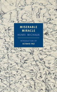 |
| I recommend it highly; be prepared for some meandering, it's to be expected. |
So far, I think I have the little palimpsests done, although I know I will make a million more, and choose my six favorites. All of my attempts at the large central piece have been investigational (read: failures). Just in case it doesn't happen, I requested titles for 3 more palimpsests, which will be shown with the others in a square layout of 9. This is a last resort, but hey, a girl's gotta have a backup plan.
So, I have SIX AND A HALF DAYS until my completed work has to be dropped off at the gallery. In ten days, I will be installing the work. In twelve days, I will be handing in the final dvd disc with all my work on it. In THIRTEEN DAYS, our thesis show opens (see my last post.)
In SEVENTEEN DAYS, I WILL BE GRADUATING! (gasp!)
4.05.2012
This is the Art of a Crazy Person
This quarter I am in the ridiculous situation of being an about-to-graduate senior taking not one, but two freshman-level classes. These are required for me to graduate; as a transfer student, I didn't realize I had to take them until last spring.
I don't hate these classes. I have been taking the lecture seminars all year and they have been relatively easy, fun, and even sometimes enlightening.
This quarter, I am also taking a foundations studio class, called Time Studio. (It's the final in the series, after Surface and Space Studios; I didn't have to take those.)
Our first assignment involved finding an iconic historical image (album cover, photograph, news image, painting, etc.) and recreate it by photographing ourselves in place of the original figures. We had to build any necessary costumes, props, and stage sets, and then combine our images within Photoshop to recreate the original image as closely as possible. The catch is that we have to be every character in the image, and we have to appear more than once.
We had about a week to do this. (Yikes. I am severely lacking in Photoshop skills.)
I chose, after much deliberation, Manet's A Bar at the Folies-Bergere, originally painted in 1882.
(If you want to listen to a fascinating theoretical analysis about this painting, check out this video from ArtRev.com.)
I was torn for a while between doing a faithful, accurate recreation OR doing a personal/autobiographical modern interpretation. I ended up with a hybrid.
The only part that I stole from the original is the top hat on the anonymous "gentleman."
The only thing I stole from Google Images was Burt Reynold's mustache. Everything else was something I found around the house or created myself. I created the marble finish of the bar by smearing graphite powder onto a large sheet of vellum- it looked pretty dumb in person, but it looks good in the final image.
I had to use Twinkies in place of the Mandarin oranges (lovelovelove) and I used beer instead of champagne. The whiskey bottle has iced tea in it- whiskey doesn't usually last long in my house. Crown Royal is a sentimental favorite; there was another bottle, but it was cropped out.
Stuff that I learned from this project:
I am not used to these short term projects with specific parameters. I was sort of dreading it, but now I realize how much I've been missing these types of assignments; I forgot that they could be fun.
If I had more time, I would have found a way to use a picture of my great-grandmother's locket in place of the barmaid's cameo. I also would have liked to use fresh flowers from my own yard, instead of the fake ones I used; unfortunately, everything in my yard is about to bloom or did weeks ago. Lastly, I never addressed the feet of the trapeze artist, which are visible in the upper left hand corner of Manet's painting. I could have photographed my own feet in green socks. I also considered replacing the feet with an image of a tiny bird on a perch which I sculpted a couple of years ago. I liked the idea of comparing Manet's barmaid to a bird in a cage. Sigh- if my Photoshop skills were better, I would have had time to fix these little details.
Next we have to re-interpret a piece of found trash into a mixed-media sculpture, using digital media. I think it's supposed to be about absurdity. FUN!
I don't hate these classes. I have been taking the lecture seminars all year and they have been relatively easy, fun, and even sometimes enlightening.
This quarter, I am also taking a foundations studio class, called Time Studio. (It's the final in the series, after Surface and Space Studios; I didn't have to take those.)
Our first assignment involved finding an iconic historical image (album cover, photograph, news image, painting, etc.) and recreate it by photographing ourselves in place of the original figures. We had to build any necessary costumes, props, and stage sets, and then combine our images within Photoshop to recreate the original image as closely as possible. The catch is that we have to be every character in the image, and we have to appear more than once.
We had about a week to do this. (Yikes. I am severely lacking in Photoshop skills.)
I chose, after much deliberation, Manet's A Bar at the Folies-Bergere, originally painted in 1882.
(If you want to listen to a fascinating theoretical analysis about this painting, check out this video from ArtRev.com.)
 |
| Manet's Bar at the Folies-Bergere, 1882. I've never seen it in person; it's permanent home is in London. But I recently saw some lovely Manets in New York, at the Metropolitan Museum of Art. Awesome. |
 | |
| I painted this background with ink on vellum. I am determined to relate this foundational work to my thesis work, no matter how tenuous the connection. In this case, I decided to use the techniques I have been developing in my advanced studios to create this background. It is by far the largest painting I have made with ink on vellum; it is about eight feet long and three feet high. |
 | |
| Here it is. What should I call it? It may be too ridiculous to title. I do kind of love it- it's hanging on my fridge. |
The only thing I stole from Google Images was Burt Reynold's mustache. Everything else was something I found around the house or created myself. I created the marble finish of the bar by smearing graphite powder onto a large sheet of vellum- it looked pretty dumb in person, but it looks good in the final image.
I had to use Twinkies in place of the Mandarin oranges (lovelovelove) and I used beer instead of champagne. The whiskey bottle has iced tea in it- whiskey doesn't usually last long in my house. Crown Royal is a sentimental favorite; there was another bottle, but it was cropped out.
Stuff that I learned from this project:
I am not used to these short term projects with specific parameters. I was sort of dreading it, but now I realize how much I've been missing these types of assignments; I forgot that they could be fun.
If I had more time, I would have found a way to use a picture of my great-grandmother's locket in place of the barmaid's cameo. I also would have liked to use fresh flowers from my own yard, instead of the fake ones I used; unfortunately, everything in my yard is about to bloom or did weeks ago. Lastly, I never addressed the feet of the trapeze artist, which are visible in the upper left hand corner of Manet's painting. I could have photographed my own feet in green socks. I also considered replacing the feet with an image of a tiny bird on a perch which I sculpted a couple of years ago. I liked the idea of comparing Manet's barmaid to a bird in a cage. Sigh- if my Photoshop skills were better, I would have had time to fix these little details.
Next we have to re-interpret a piece of found trash into a mixed-media sculpture, using digital media. I think it's supposed to be about absurdity. FUN!
2.06.2012
The Sculpture That Forgot Its Own Name
My thesis-related work has ruled my thoughts and actions for quite a while now. This quarter, my studio classes include Drawing, Sculpture, and Woodworking. I wasn't sure I could force wood to apply to my thesis, so I decided to relax a bit, and just focus on picking up some skills and making some interesting forms. It would be nice, for a change, to just think about beauty as the sole raison d'être.
Meanwhile, Matt, our teacher, taught us how to laminate wood into curved forms. Basically, you plane down wood into thin strips (about an 1/8 inch thick is good). Then you slather the strips with wood glue, and quickly stack them up and bind them together (Matt used cut up strips of old bicycle tires). Then, while the glue is still wet, the wood is bent around some sturdy, curved form and clamped into place. As soon as the glue dries, the wood is ready to be unclamped, unwrapped, and sanded down to remove the crusty glue.
I decided to use this technique for the base of my sculpture, because I could make it sturdy and solid enough to drill holes into, to hold the tapered wood forms, kind of like candlesticks pushed into a candlestick holder.
The next time I saw the sketch I had made for my sculpture, I accidentally glanced at it upside-down.
It looked like a basket with the bottom torn out. It looked empty, and strange, and it reminded me of my head right after the seizure. I decided to suspend the sculpture, upside-down, and hang it from invisible string. I also decided to not close the laminated hoop. I decided to cut a gap in it, like an opening or gateway into the basket-like shape.


 So, the title of my sculpture is It Forgot Its Own Name. This title refers to two different but complementary ideas.
First: Matt and I were discusing the amount of "spring-back" that wood has. Some might call it "memory;" it's the ability of wood to recover its shape when it has been bent. For a living tree, this is necessary for survival. The more a tree bends and recovers, the more interesting its grain can become. But, since I was working with cut, dried wood, I was able to bend it and have it maintain the bend, with only a little spring-back. I was altering or erasing its "memory." But, the essential wood-ness remains; it might "forget" how it grew, but it still exists as proof of its growth.
Second: The title is a reference to the memory loss I feel right after a seizure. Not only do I not remember my own name, I don't even remember that I ever had a name to forget. Luckily, this feeling doesn't last, because it's absolutely awful.
This was, I think, the best show I've been in. The rest of the work was amazing,
so of course I took pictures:
These sculptures, and others, were all installed in the Meyers Gallery last week. I wanted to include pictures of some of my favorites, and to show the incredible variety of approaches among my classmates.
Our first assignment was to build a wood steamer. Our first project had to be built with bent wood; steaming is one of the simplest ways to soften wood for bending. While we were figuring out some technical issues with the steamer, I came up with a simple sketch for my sculpture. It resembled a sort of nest, with a circular base and several curved, tapered branches reaching out of the base and meeting in a tangle a few feet above.
 |
| This is the original sketch, doodled during a lecture class. The term at the bottom, tertium quid, literally means "the third thing." It refers to the whole which is greater than the sum of its parts, and it was the first title of this piece. In the top right corner, I wrote "onion, solar flare, brain cell;" I researched all of those three forms while refining my sketch. |
Meanwhile, Matt, our teacher, taught us how to laminate wood into curved forms. Basically, you plane down wood into thin strips (about an 1/8 inch thick is good). Then you slather the strips with wood glue, and quickly stack them up and bind them together (Matt used cut up strips of old bicycle tires). Then, while the glue is still wet, the wood is bent around some sturdy, curved form and clamped into place. As soon as the glue dries, the wood is ready to be unclamped, unwrapped, and sanded down to remove the crusty glue.
I decided to use this technique for the base of my sculpture, because I could make it sturdy and solid enough to drill holes into, to hold the tapered wood forms, kind of like candlesticks pushed into a candlestick holder.
We also learned about another technique to bend wood, which just involves soaking the wood in a solution of water and fabric softener. This method appealed to me, because I could work on it at home, by soaking the wood in my bathtub. I bought a bunch of dowel rods, of varying widths and lengths, and began soaking them overnight in batches. I bent them, still damp, into bowed shapes and tied them with twine. Once they were dry, I was able to soak them again, by immersing them halfway in a bucket of the same solution, and bend the ends back the other way. This way, I was able to get some really nice, elegant S-curves. Which smelled like fresh laundry.Then, while all this productive work was happening, BAM, I had a seizure. It had been a really long time since my last seizure, and I forgot how much it really, really sucks. I won't go into detail, but suddenly my perspective on my thesis work became much more focused.
The next time I saw the sketch I had made for my sculpture, I accidentally glanced at it upside-down.
 |
| Once I decided to flip it upside down, I also re-drew a portion of the main hoop so it was open, not closed. |
The time-consuming task of tapering the dowel rods took over my life for a few days. I probably should have bought some specific hand tool to make my job easier, such as a spoke-shaver or a scraper. Instead, I developed a tedious process of hand-sanding each rod, then sharpening it to a rough point on the disc sander. Then, I used a whittling knife to refine each point. I sanded the points smooth, with a rough sanding block. Finally, I polished each ivory-smooth with fine sandpaper.When it came time to assemble the sculpture, I rubbed beeswax into each separate part, because I didn't want to use some stinky varnish, and I didn't want to alter the appearance of the wood too much. I drilled the holes very slowly and deliberately, deciding the placement of each rod very carefully.
It was important to me that the finished form had some of that beauty that I originally aimed for. The meaning of the piece had changed in my head, and had, despite my intentions, become related to my thesis. The emptiness, the thorniness, and the paleness of it were all somehow perfectly descriptive of my own scary emptiness moments after the seizure. By keeping it beautiful, I think I was trying to edge out the despair with some hope, or peace, or something. It may sound corny, but I don't know how else to explain it.


First: Matt and I were discusing the amount of "spring-back" that wood has. Some might call it "memory;" it's the ability of wood to recover its shape when it has been bent. For a living tree, this is necessary for survival. The more a tree bends and recovers, the more interesting its grain can become. But, since I was working with cut, dried wood, I was able to bend it and have it maintain the bend, with only a little spring-back. I was altering or erasing its "memory." But, the essential wood-ness remains; it might "forget" how it grew, but it still exists as proof of its growth.
Second: The title is a reference to the memory loss I feel right after a seizure. Not only do I not remember my own name, I don't even remember that I ever had a name to forget. Luckily, this feeling doesn't last, because it's absolutely awful.
This was, I think, the best show I've been in. The rest of the work was amazing,
so of course I took pictures:
 |
| Unidentified Mammal Skeleton #1, by Marty Rossman. This is one of the best pieces in the show (in my opinion); it is very well lit and eye-catching. |
 |
| Undulate, by Meredith Waddell. Meredith bent her wood with a different method, which involved rocking the thin strips of damp wood back and forth over a propane-heated pipe. Her piece is very striking in person; when you look at it head-on, the stripes of wood look perfectly straight. |
 |
| Step On Me, by Jeff Badger. Jeff curved thin pieces of wood by steaming them and clamping them to the insides of trashcans while they dried. Then he cut them up into these chips, which look like skin cells to me, and laid them out on the floor in a large frame. Simple, but good. |
 |
| Pete and Repeat, by Daniel Lawson. This was one of the largest pieces in the show; Daniel definitely bent the largest pieces of lumber. I like that there is so much grace and delicacy, but it's still really rough lumber. |
These sculptures, and others, were all installed in the Meyers Gallery last week. I wanted to include pictures of some of my favorites, and to show the incredible variety of approaches among my classmates.
4.22.2011
Studio Work: Printmaking
Just as I suspected, printmaking is SO MUCH FUN!!!
Professor John Stewart, the same talented guy who taught Advanced Figure Drawing last quarter, is teaching Intro to Relief Printmaking this quarter. I am officially a big fan of J-Stew. It's mutual- the other day he confided that he liked me because I'm "a grown-up." Ha- that's what he thinks!
 |
| Project 1a: Pink Kiss, 5" x 8" |
 |
| Project 1b: Ugly Me, 8" x 5" |
PROJECT ONE: Self-portrait (again???)
Having more than enough self-portraits, I decided to do a kiss-portrait instead. I donned lipstick, kissed paper, scanned it and enlarged it, and traced it onto a linoleum block.
I was totally happy with the results, but I finished early (what a STRANGE feeling!) so I decided to be an over-achiever and do another one. For Ugly Me, I was inspired by a conversation I had with John. We talked about how because we are used to seeing mirror images of ourselves, our own faces can look really strange in photos. I decided to do a self-portrait in which I exaggerated all of my asymmetry. The result was a pretty accurate depiction of me before my morning coffee.
PROJECT TWO: Shape and Shadow
The challenge here was to show volume and form with black and white only. This can be tricky, as I learned last quarter in Comics class. But with printmaking, it's more difficult because positive and negative space are reversed- you don't draw in the black, you carve out the white! I drew a larger-than-life ice cream cone, and threw in a dark shadow for some drama. We also had to complete an edition of three identical prints.
 |
| Project 2: Big Scoop, 14" x 10" |
 |
| This image shows the inked block next to some prints. |
 | |
| The one on the upper left is known as the "Artist's Proof." It is not included in the edition because the registration is slightly off and I carved a few minor adjustments before the next print. |
John expects the very best prints on perfectly clean, handmade Japanese paper. The registration should be perfectly straight, with symmetrical borders (a little extra on the bottom margin for a signature). The ink should be applied just right- just enough for solid coverage, but not too much! It takes forever for the oil ink to dry on the cotton paper.
PROJECT THREE: Stay Tuned!
For our next assignment, we will be doing double color prints, using the press, and pulling a larger edition. Fun!
If anyone has any ideas for subject matter, let me know!
4.08.2011
A Special Bond
Finally!
I know I promised this weeks ago, but I finally have decent images of the 4-page comic, which was my final project for Carol Tyler's Comics class.This project took hours and hours and hours... I lost count after 25.
Ms. Tyler is a bit of a sadist, I think!


Thanks to Joey for helping me compress the file without the images being blurry!
It there's anything I learned from this class, it's that writing an entire graphic novel would be a terrifying and difficult task. I definitely appreciate it and respect it as an art form, and take my word for it, you should too.
If you are interested in reading some amazing graphic novels, I've listed some of my favorites below.
 |
| Binky Brown Meets the Holy Virgin Mary by Justin Green |
Justin Green is generally acknowledged to be the father of the Graphic Memoir genre. I may have never read this book, but Mr. Green is Carol Tyler's husband, and I was curious. It was really, REALLY good. Almost as good as Ms. Tyler's masterpiece, You'll Never Know. I know that including it in this list may seem like brown-nosing, but I SWEAR it's worth reading.
 | ||
| This is Book Two; she's currently working on Book Three. I can't wait to read it! |
 |
| Maus by Art Spiegelman; this is volume one of two |
Maus by Art Spiegelman is one of the most haunting books you'll ever read, graphic or not. It tells the story of Mr. Spiegelman's father, who was a holocaust survivor. If you decide to read only one book that I recommend, make it this one!!
 |
| Boulevard of Broken Dreams by Kim Deitch |
My next post will be about printmaking. MUCH less stressful than cartooning!
3.22.2011
Yee-Haw for Printmaking!
Today I visited Yee-Haw Industries in Knoxville, Tennessee, with my friend Rhainy. (She's gonna be an art teacher too!)
Yee-Haw has been in operation since 1996, as a unique storefront/ studio/ print factory. The small area up front is packed with merchandise, including hand-printed signs, posters, cards, fabric, and clothing, all manufactured on site.

The staff allowed us to prowl around the back, where we were fascinated and overwhelmed by the vast amount of printing blocks and typeface. The walls were filled with their unique products, and the ceiling was partly covered too. Everywhere we looked, there was something amazing. They let me take pictures of everything, as long as I promised not to steal any of their designs.
(Side note: I hate shopping in a store full of amazing stuff when I have NO money to spend!)
Yee-Haw is in a 100+-year-old building on Gay Street in historic downtown Knoxville (just a few doors down from where Hank Sr. was last seen alive).
The studio has recently collaborated with the National Gallery of Art to design & produce a unique line of Dada merchandise, available exclusively at the National Gallery for the duration of the 2006 Dada exhibition.
Yee-Haw Industries located in the heart of downtown Knoxville, TN, 413 South Gay Street with a neon Yee-Haw in the front window. You can't miss it.
Unless you're me and Rhainy... we drove past it twice. Maybe three times.
http://www.yeehawindustries.com/home.html
Visit their website for more info. Once there, you can also link to their Etsy store and their own blog.
Yee-Haw has been in operation since 1996, as a unique storefront/ studio/ print factory. The small area up front is packed with merchandise, including hand-printed signs, posters, cards, fabric, and clothing, all manufactured on site.

The staff allowed us to prowl around the back, where we were fascinated and overwhelmed by the vast amount of printing blocks and typeface. The walls were filled with their unique products, and the ceiling was partly covered too. Everywhere we looked, there was something amazing. They let me take pictures of everything, as long as I promised not to steal any of their designs.
(Side note: I hate shopping in a store full of amazing stuff when I have NO money to spend!)
 |
| Posters to the ceiling, and then some |
Yee-Haw is in a 100+-year-old building on Gay Street in historic downtown Knoxville (just a few doors down from where Hank Sr. was last seen alive).
The studio has recently collaborated with the National Gallery of Art to design & produce a unique line of Dada merchandise, available exclusively at the National Gallery for the duration of the 2006 Dada exhibition.
 |
| By Yee-Haw artist Kevin Bradley: It is a Hugo Ball nonsense poem from 1917 - during the Dada period. |
 |
| HUNDREDS of drawers of typeface |
 |
| thousands of antique metal dingbats |
Unless you're me and Rhainy... we drove past it twice. Maybe three times.
 |
| countless one-of-a-kind wooden and linoleum plates |
 |
| So much fun stuff to look at! |
Visit their website for more info. Once there, you can also link to their Etsy store and their own blog.
3.01.2011
RESEARCH, my new best friend
Research is not a pleasant word for most students. It conjures images of bleary-eyed long sessions in front of the computer, hours lost in the stacks at the library, taking detailed notes so the works-cited page will be complete... NOT fun.
But research for the artist is fun, and pretty much necessary. To me, it's has become a valued part of the artistic process. After the initial inspiration, it's the next step. Sometimes a little research will turn me off to an idea, and that's okay, because it always opens me up to a million other ideas in the process.
As a kid I used to love the glossy pages of the family's multi-volume encyclopedia and the dictionary. I would sit for hours and look through them, loving the way the information was organized, in alphabetical order with no consideration to topic. This organization combined with arbitrariness is still intriguing to me today, and is often a major device I use when communicating with my own artwork.
My new favorite gadget for research is the iPad. I use Google Image search, look up the topic I want, and with just one touch I save the image to a folder. I can access the folder easily and quickly and take it anywhere, even places without internet access, and have those images ready for reference.Why is this so great? First, I can edit and delete these photos anytime. Also, I can flip through them easily with a slideshow or thumbnails, and zooming in on the details is no problem. Also, in the course of any normal web browsing, I can save any intriguing images to be looked over later when I need a little inspiration.
Just in case you were wondering, I never just copy these images into my work. I just select bits and pieces, such as color palettes and perspectives, to use in my process. I recently wanted to do a series about circus freaks, presented as vintage side show posters, which were actually showcasing very mundane exhibits, in order to illustrate the hypocrisy of xenophobia. I haven't done it yet, but I have about a hundred examples of vintage circus posters ready to go on my iPad when I'm ready.
Research is a multi-faceted process, and in actuality, it never ends for an artist. I'm always observing and gathering new visual data, both to support existing ideas and to form new ones. It's easy to get stuck in a routine where you don't just LOOK AT THE WORLD around you- I try to stay out of that routine.
One more thing: just in case I haven't made it clear, research for me is more than just gathering visual data. I love to know the history of things, people and places when I put them in my work. If I'm making up a subject out of my imagination, there is still always a link to the real world (it's unavoidable) and I can't help but assign a story to my new subject. Why? It helps me convey the message, and it's more fun.
But research for the artist is fun, and pretty much necessary. To me, it's has become a valued part of the artistic process. After the initial inspiration, it's the next step. Sometimes a little research will turn me off to an idea, and that's okay, because it always opens me up to a million other ideas in the process.
As a kid I used to love the glossy pages of the family's multi-volume encyclopedia and the dictionary. I would sit for hours and look through them, loving the way the information was organized, in alphabetical order with no consideration to topic. This organization combined with arbitrariness is still intriguing to me today, and is often a major device I use when communicating with my own artwork.
 |
| See what I mean? Volume 19: Excretion through Geometry. You can't make this stuff up! |
My new favorite gadget for research is the iPad. I use Google Image search, look up the topic I want, and with just one touch I save the image to a folder. I can access the folder easily and quickly and take it anywhere, even places without internet access, and have those images ready for reference.Why is this so great? First, I can edit and delete these photos anytime. Also, I can flip through them easily with a slideshow or thumbnails, and zooming in on the details is no problem. Also, in the course of any normal web browsing, I can save any intriguing images to be looked over later when I need a little inspiration.
Just in case you were wondering, I never just copy these images into my work. I just select bits and pieces, such as color palettes and perspectives, to use in my process. I recently wanted to do a series about circus freaks, presented as vintage side show posters, which were actually showcasing very mundane exhibits, in order to illustrate the hypocrisy of xenophobia. I haven't done it yet, but I have about a hundred examples of vintage circus posters ready to go on my iPad when I'm ready.
 |
| See? Fun! Just as a note: it took me ten times longer to search, save, and upload this image onto this blog than it would have for me to find and save it on my iPad. |
Research is a multi-faceted process, and in actuality, it never ends for an artist. I'm always observing and gathering new visual data, both to support existing ideas and to form new ones. It's easy to get stuck in a routine where you don't just LOOK AT THE WORLD around you- I try to stay out of that routine.
One more thing: just in case I haven't made it clear, research for me is more than just gathering visual data. I love to know the history of things, people and places when I put them in my work. If I'm making up a subject out of my imagination, there is still always a link to the real world (it's unavoidable) and I can't help but assign a story to my new subject. Why? It helps me convey the message, and it's more fun.
Artist and Professor John Stewart
I am lucky to be a student in John Stewart's Figure Drawing class this quarter. I am also lucky that he allowed me and fellow classmate Kelsey to interview him today. He has lots of interesting stories.
He's been a member of UC's faculty since "a week before they discovered dirt," in other words, almost 38 years. He's a world traveler, spending much of his childhood in military bases in Japan and Germany. He backpacked through Europe when he was young. Shortly after arriving in Paris, he was walking through a museum when he saw The Lacemaker by Vermeer.
He says he got goosebumps and chills when he saw it, and it still does to this day (he showed me the goosebumps on his arm as proof!). Up until that moment, he had been a printmaker and sculptor and was not all that impressed with painting. Vermeer changed his mind. He spent the rest of his European vacation tracking down as many Vermeer originals as he could, and saw nearly all of them.
When I asked him if he had any other major influences in his work as an artist, he didn't hesitate for a second to mention Caroll Spinney, puppeteer and creator of Oscar the Grouch (my favorite!) and Big Bird. Before his Sesame Street days, Spinney worked as a cartoonist for a paper on the military base where Stewart lived as a teenager in Germany. He made a huge impression because he was having fun at his job, which was, needless to say, RARE on a military base in Germany. John says he ways always fascinated with the visual world and artistically inclined, but it took the creator of Big Bird to make him realize that being an artist was a possibility.
Today John Stewart teaches life drawing and painting at the University of Cincinnati. His own current work features oil paintings of landscapes and the human figure.
 |
| John Stewart, artist and professor |
He's been a member of UC's faculty since "a week before they discovered dirt," in other words, almost 38 years. He's a world traveler, spending much of his childhood in military bases in Japan and Germany. He backpacked through Europe when he was young. Shortly after arriving in Paris, he was walking through a museum when he saw The Lacemaker by Vermeer.
 |
| Tiny, perfect: The Lacemaker by Vermeer |
He says he got goosebumps and chills when he saw it, and it still does to this day (he showed me the goosebumps on his arm as proof!). Up until that moment, he had been a printmaker and sculptor and was not all that impressed with painting. Vermeer changed his mind. He spent the rest of his European vacation tracking down as many Vermeer originals as he could, and saw nearly all of them.
When I asked him if he had any other major influences in his work as an artist, he didn't hesitate for a second to mention Caroll Spinney, puppeteer and creator of Oscar the Grouch (my favorite!) and Big Bird. Before his Sesame Street days, Spinney worked as a cartoonist for a paper on the military base where Stewart lived as a teenager in Germany. He made a huge impression because he was having fun at his job, which was, needless to say, RARE on a military base in Germany. John says he ways always fascinated with the visual world and artistically inclined, but it took the creator of Big Bird to make him realize that being an artist was a possibility.
 |
| Carroll Spinney with his most famous creations |
Today John Stewart teaches life drawing and painting at the University of Cincinnati. His own current work features oil paintings of landscapes and the human figure.
Subscribe to:
Posts (Atom)